Russian Cursive: Converter, Full Letter Chart and Practice Sheet
Russian cursive is the joined-up handwriting that Russian children learn at school, usually from first grade, and that many adults go on using for notes, letters and forms. It is the same 33-letter alphabet as print, but several letters change shape so much that a learner who reads print fluently can be stumped by a handwritten note. The converter below shows any Russian text in a cursive-style font and prints a practice sheet for tracing.
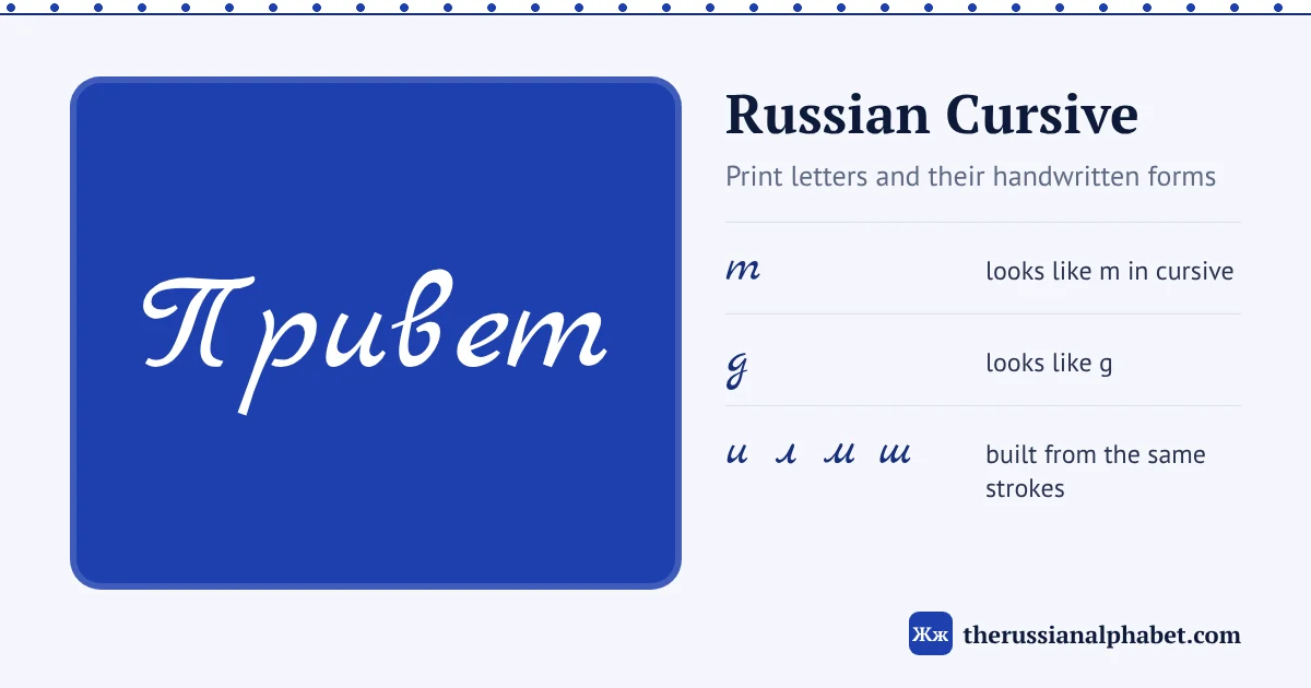
Most Russian cursive letters are recognisable, but a few look like different Latin letters: т looks like m, д like g, и like u, п like n and у like y. Learn those first, then practise by tracing: type a word below and press Print practice sheet.
Russian cursive converter
Type Russian in print letters and see it in cursive. Use the slider to resize, tick Show letter-by-letter to compare each cursive letter with its print form, and print a tracing sheet.
What you are seeing
The converter and the chart on this page use Marck Script, a free handwriting font that includes Cyrillic. It is a close approximation of the cursive taught in Russian schools, not an exact copy. Real handwriting joins every letter in a continuous line, and the shapes in school copybooks, called прописи (propisi), are more rounded and regular than any font. Adults also develop personal variations. Treat the font as a reliable guide to letter shapes, and expect real notes to look a little different.
The converter does not change your spelling; it only changes how the letters look. Type in ordinary Russian print (the online Russian keyboard helps if you don’t have a Cyrillic layout). The default sentence is (privet, kak dela: “Hi, how are you?”).
Print vs cursive: all 33 letters
Capital and small letters, in alphabetical order. The cursive column uses the same font as the converter. You can also switch the interactive Russian alphabet chart to handwriting and hear each letter.
| Cursive | What to watch | |
|---|---|---|
| А а | А а | Recognisable from the print shape. |
| Б б | Б б | Lowercase has its bow on the left and a stem that curves right along the top. |
| В в | В в | Recognisable from the print shape. |
| Г г | Г г | Lowercase is a single rounded stroke with no starting hook, which separates it from л. |
| Д д | Д д | Lowercase usually looks like a Latin g, with a loop below the line; some people write it like ∂. |
| Е е | Е е | Recognisable from the print shape. |
| Ё ё | Ё ё | Same as е with two dots, which are often left out. |
| Ж ж | Ж ж | Shapes vary a lot between writers. |
| З з | З з | Looks like the numeral 3 with a loop below the line. |
| И и | И и | Looks like a Latin u. |
| Й й | Й й | A Latin-u shape with a small curved mark (breve) on top. |
| К к | К к | Recognisable from the print shape. |
| Л л | Л л | Starts with a small hook at the bottom left, then one stroke up and down. |
| М м | М м | Starts with the same small hook, then two humps. |
| Н н | Н н | Recognisable from the print shape. |
| О о | О о | Recognisable from the print shape. |
| П п | П п | Lowercase looks like a Latin n. |
| Р р | Р р | Recognisable from the print shape. |
| С с | С с | Recognisable from the print shape. |
| Т т | Т т | Lowercase looks like a Latin m. |
| У у | У у | Looks like a Latin y. |
| Ф ф | Ф ф | Recognisable from the print shape. |
| Х х | Х х | Recognisable from the print shape. |
| Ц ц | Ц ц | Like и with a short tail below the line. |
| Ч ч | Ч ч | Recognisable from the print shape. |
| Ш ш | Ш ш | Three downstrokes joined at the bottom, like an upside-down m. |
| Щ щ | Щ щ | Like ш with a short tail below the line. |
| Ъ ъ | Ъ ъ | Recognisable from the print shape. |
| Ы ы | Ы ы | A soft-sign shape followed by a separate downstroke. |
| Ь ь | Ь ь | Recognisable from the print shape. |
| Э э | Э э | Recognisable from the print shape. |
| Ю ю | Ю ю | Recognisable from the print shape. |
| Я я | Я я | Starts with a small hook, like л and м. |
The letters that change most
English speakers read cursive by matching shapes to Latin letters they know, and that habit is exactly what goes wrong here. Five lowercase letters look like a different Latin letter:
| Cursive | Looks like | Actually | Sound |
|---|---|---|---|
| т | m | т | t |
| д | g | д | d |
| и | u | и | ee |
| п | n | п | p |
| у | y | у | oo |
So the handwritten word that seems to read “gom” is (dom, house), and what looks like “mam” can be (tam, there).
The и, л, м, ш family
The harder problem is a group of letters built from the same short downstrokes. Wikipedia’s Russian cursive article lists и, л, м, ш, щ and ы as letters that all contain half of a cursive u. The BYU Script Tutorial describes the small hook that л, м and я start with, which is what separates them from и and г. Count strokes and look for the hook:
- и: two downstrokes, no hook
- л: hook, then one downstroke
- м: hook, then two downstrokes
- ш: three downstrokes, no hook
- т: three downstrokes joined at the top, like m
Words made only of these letters are a classic reading test. Try (tishina, silence; stress: ti-shi-NA), (shinshilla, chinchilla; stress: shin-SHIL-la) and (lishish’, “you will deprive”; stress: li-SHISH) in the converter, then tick Show letter-by-letter to see where each letter starts and ends.
Lines over т and under ш
Because cursive т and ш can be written with similar strokes, many writers add a short horizontal line to tell them apart: a line above т and a line below ш. Both the Wikipedia article and the BYU tutorial describe this as optional. Some people do it every time, many never do, and some simply write т in its printed T shape instead. If you see a line over or under a run of strokes, it is a signal, not a separate letter.
The font on this page does not add these lines. If you want them in your own handwriting, add them by hand on the practice sheet.
Two other small habits show up in handwriting. The dots on ё are often left off, just as in print. And some writers put a line above п so it is not mistaken for и.
How to practise
- Read before you write. Go down the chart above and cover the print column. Name each cursive letter out loud, then check.
- Start with the five lookalikes. Write т, д, и, п and у ten times each while saying the sound, so the Latin reading fades.
- Print a tracing sheet. Type a word or short phrase into the converter and press Print practice sheet. The sheet has one dark model line, nine light grey lines to trace over and two empty ruled lines to write on your own.
- Move to real words. Use short, common words such as (mama, mum), (spasibo, thank you; stress: spa-SI-bo) and (privet, hi; stress: pri-VYET). Our pages on thank you in Russian and hello in Russian have more to copy.
- Join the letters. Once single letters feel natural, write whole words without lifting the pen, the way they are taught in school.
The size slider (24 to 72 pixels) is handy here: large sizes show the stroke shapes clearly for copying, and smaller sizes look more like real handwriting for reading practice. To check you know the letters themselves, take the Russian alphabet quiz.
FAQ
Do Russians still write in cursive?
Yes. Cursive is taught in Russian schools from first grade, so it is the handwriting most Russians learn, and handwritten notes and forms are commonly written in it.
Why does Russian т look like an m in handwriting?
The standard cursive form of lowercase т is three joined downstrokes, which matches the shape of a Latin m. To avoid confusion with ш, some writers add a line above т and a line below ш.
Is Russian cursive hard to learn?
Most letters resemble their print forms; the main work is unlearning the Latin readings of т, д, и, п and у and telling apart letters built from similar strokes.
Can I print Russian cursive worksheets?
Yes. Type any Russian word or phrase into the converter on this page and press Print practice sheet. You get a model line, nine grey lines to trace and two blank lines.